Pages

Saturday, 12 November 2011

Do Store Interiors Make You Buy?

I’ve currently been reading articles about the interior design of stores and whether or not it increases sales. Does a shop layout, environment, visual merchandising and interior design make people buy? It has been proven that it does. In today’s market where competition is fierce the design of a shop is where some companies would be able to gain an edge over their competitors. A shops atmosphere can attract customers and keep them coming back.

Andrea Groeppcl-KIein and Dorothea Baun test this theory in their journal ‘The Role of Customers’ Arousal for Retail Stores- Results from Experimental Pilot Study Using Electro dermal Activity as Indicator.’ They agreed with other experts such as Donvan and Rossiter that a pleasant store environment generates arousal and pleasure in the customer which in turn increases; shopping enjoyment, time spent in the store, a willingness to talk to personnel, chances of customers spending more money than planned and their probability of returning to the store.  However they felt that other articles simply measured this on a verbal scale which may not generate accurate results. They propose to use Electro dermal Activity (EDA) to measure a customer’s arousal in a store. EDA is a sensitive indicator that responds to the smallest variation in a person’s arousal.

They set up two different grocery stores in Austria both selling the same products, of the same quality and price.

Store 1 took into account environmental psychology. The fruit and veg were presented in a large scale in deep carriers and separated according to colour. Some products were placed on islands in the middle of the store. Exotic fruit, flowers and fresh herbs were used as eye catchers. The store was bright, spacious and high ceilinged.


Store 2 did not take into account environmental psychology. It wasn’t very bright and there was no extraordinary product presentation unlike store 1. Shelving was put along side the wall and display tables were in rows squeezed within long narrow aisles.

As they thought Store 1 created a higher arousing environment.

So, why does a more pleasant environment make us want to buy or revisit a shop?  Well an interesting and provocative store design affects the part of the brain involved with filtering sensory information from the central nervous system. All sensory information enhances arousal which therefore causes activity and reactivity in the central nervous system. This increases outer and inner stimulation which leads to higher activation and activity. Basically a pleasant store atmosphere evokes positive feelings which will then be associated with the shop and the brand. Stores with clear and simple structures make people feel relaxed therefore more comfortably in the store. When we are comfortable, relaxed and enjoying ourselves we are open to buying.

I know that I’m definitely affected by a stores design there are some shops I dread going into and rarely buy from because the shop is messy, unorganised and overcrowded. Shopping is more pleasurable for me when it’s a calm experience. I like stores that aren’t busy or noisy, that smell nice, have their items laid out clearly, and changing rooms that aren’t claustrophobic. This makes me want to buy; the whole experience feels like I’m treating myself from the moment I walk in to when I leave with my item nicely wrapped and bagged.


Wednesday, 9 November 2011

Student Designers: Business Designed.

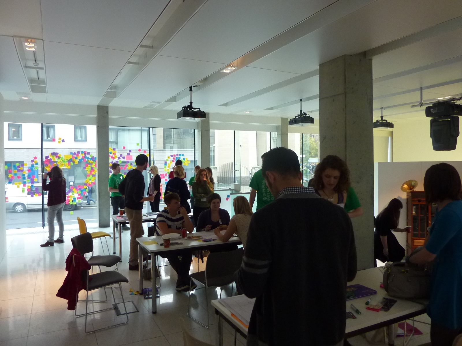
Student Designers hosted there first student workshop in Edinburgh last Friday and I was lucky enough to get the chance to take part.

The workshop began at 10am, myself and a few other students from DJCAD arrived slightly before to sign in and check out the space. Eight work stations were set up with post its, pencils and other tools we would need throughout the day.  After a quick introduction we were split into groups where we brainstormed a topic using post it notes for a set time before being moved on to the next topic.


After a coffee break and getting to know each other we were then re-grouped for the next part of the day. Each group was given a topic that was brainstormed earlier and asked to come up with a business design relating to the subject. Our topic was ‘Environmental Sustainability’ we looked into ideas of swap shops and rebranding charity shops but we eventually decided to go down the transportation route. The final idea was to create a bike scheme where students could hire bikes for free to cycle in and around the area surrounding their university. We developed personas of who would use the product then mapped out our business model on one of the sheets provided.


Later all the groups got together with a few beers and presented their work. Everyone’s ideas were quite impressive considering we only had a day to design something. A favourite of mine was ‘Digi Doc’ an interactive phone app to cut out the embarrassment of going to the doctor and telling them your problem face to face.


The main reason I wanted to take part in the workshop was to gain experience working with others outside of university and meet new people. I get really awkward speaking in public and knew we would have to pitch so I’m hoping the more experience I get doing this the more comfortable I’ll be. I also got to apply some knowledge and skills I’ve been acquiring in my Advertising & Branding module at uni. It was a really good day, we were kept busy, encouraged when we lost focus and given plenty of free food and drink throughout the day. I’d definitely like to take part again.

Tuesday, 8 November 2011

Pecha Kucha Night Dundee.

Just a quick blog about my first proper Pecha Kucha experience.

Since my class has been encouraged to present our work in a Pecha Kucha style – 20 slides, 20 seconds to talk about them- a couple of times this year I was quite excited there was an event on in Dundee. I went along tonight to see how professionals coped talking about their subject of choice and what exactly a PKN is like.


The event was sold out and after the success of tonight I suggest you get your tickets early for vol.2. The atmosphere was friendly and relaxed. There were 11 speakers all of which gave interesting talks on a variety of subjects from computer games to empathy. A couple of my favourite speakers were Hilary Grant and Ross Fraser McLean.

Hilary Grant a textiles graduate discussed her career after university. From working for others in London and the Highlands, she has now set up her own business in Dundee which looks like it will be a great success. She talked about her work and showed images of her scarves, they look amazing I want to get my hands on one for Christmas!

Image by 'What Kristen Saw'

Kate Pickering of Vanilla Ink also discussed her life after uni. Showing its okay to feel lost after you graduate, that it takes time to find your path, something I find particularly encouraging. She is now setting up a business to help other students bridge the gap between uni and the workplace after they graduate.

Ross Fraser McLean a photographer told a crazy story about being abducted by a snake charmer after he saw his snake in the park. We never did find out how he escaped but saw some beautiful pictures from his adventure.


Everyone gave a terrific presentation and of course I can’t forget my tutor Andy Milligan. Andy you were fab!

All in all it was a fun night and I would definitely do it again. It’s a laid back way of finding out some interesting facts.  Also it was great to see how much talent is in Dundee and how many people are interested in and support Dundee’s creativity. 

Monday, 7 November 2011

Branding Space & Place. Glasgow Trip.

Last week I took a trip to Glasgow to examine the brand identity of places and spaces in the area.

‘The Brand Gap’ by Marty Neumeier defines Brand Identity as ‘The outward expression of a brand, including its name, trademark, communications, and visual appearance.’

Firstly I had a look at Merchant City. Merchant City is an area in the city centre of Glasgow which has recently been rebranded by Graven Images. Before rebranding they looked at the positives and negatives of the area. The positives were that it is a thriving, regenerating and attractive area. The negatives were that no one knew the boundaries of it, its identity was weak and its brand was under promoted. After seeing the area for myself I felt that some of the negatives still have to be addressed, to me the boundaries were unclear. Street signs showed when you were in Merchant City but I didn’t know exactly where it began and where it ended. It is an attractive area with lots of beautiful architecture which suited its high end stores such as ‘Mulberry’ and ‘Ralph Lauren’. However some areas were run down and covered in graffiti which didn’t make its identity consistent.


I think that places are perhaps harder to brand as it is an environment that can’t be strictly controlled unlike the interiors of a store that has constant security and staff to make sure everything is in line and up to standard. 

Later I went to the Apple Store. The grand building reflected the quality of its products. The space inside was very modern, the products were laid out on wooden tables giving an informal homely vibe which made people more inclined to become familiar with the product. The fact that the store was so welcoming links with Apples laid back, user/customer friendly image. Staff were highlighted in blue t-shirts and were swarming around the store ready to help, one member of staff to every person.  The store made me think of Apple as; friendly, helpful, modern, of high quality and cool, successfully portraying its brand.


All Saints was another store I viewed. Its interior was quite industrial with stage lights hanging from the ceiling, cogs and machinery all around and a battered wooden floor. In the window were rows and rows of sewing machines. This store reflected the style of clothes sold, the way the clothes are made, the seams stitched in a miss matched fashion was shown by having sewing machines visible. The industrial theme shows the brand as being, edgy, trendy, grungy and unique.


John Lewis is not my favourite shop I find it too chaotic and would rather not shop somewhere where there is an endless selection of items on offer. The space is very busy but is laid out in sections according to product. Before you enter there is a map telling you what floor you’re on and what products are available on each floor. The make up was found at the front leading onto jewellery, accessories, stationary then men’s fashion. Everything is laid out in a certain way to make the shopper buy. Products that customers won’t go looking for are placed by the escalators in the hope that they will notice them and buy. Big brand, big store.

Lastly I spotted a few differences between the two main shopping centres in Glasgow, Buchanan Galleries and Princes Square. Buchanan Galleries consisted of high street shops for a mixed age group. The interior is very basic. It has a food court which consists of takeaway food stands such as Burger King. I feel it’s a place that is aimed towards families spending a day shopping or teenagers hanging out on Saturdays.

Princes Square on the other hand, has a brighter, more luxurious interior with wooden floors and spiralling stairs. This is reflected by the high end more expensive stores. There are fewer stores within Princes Square; it seems they have gone for quality over quantity. Instead of a food court they have a selection of restaurants where people sit in to eat. I think young professionals would be the main clientele for this shopping centre.


I don’t know a lot about store design yet but I’m hoping to change this through my research in block two of my advertising and branding module. However I think if you look closely enough you can see some of the signals shops are sending to attract their preferred customer and make them buy.

Tuesday, 1 November 2011

24 Hour Brief… Revisited.

The other week I got together with a couple of members from my group to discuss the final advert we designed for the 24 Hour brief. We wanted to look at the problems of the previous advert and find ways to change it for the better.


Notes from group discussion.

The main problem with our last advert was that it was too serious and may have made people panic unnecessarily. We thought that by keeping the same message but making the advert light hearted and funny might solve this.

Our last advert was a poster campaign but as we were brainstorming we came up with ideas that could be made into a television advert. The general idea of the original ad was used again but to make it slightly humorous we decided to show the illness as a cartoon monster that grows as the condition of the man worsens. The viewers will see an x-ray of his chest with the monster squeezing at his heart. The longer he puts off going to the doctors the stronger the monster gets. Instead of having several different men with different symptoms we decided to stay with the one story from the previous advert. His daughter, work colleague, partner notice his pain and will ask him if he’s alright and he will dismiss their comments saying he’s ‘Just unfit/tired’. After his partner asks him she picks up a trash bag, takes it out to the bin while the viewer hears her making an appointment at the local GP for her husband. The final scene is the monster being left in the bin and the wife closing the lid on it. The revised tag line would be “Take Out the Monster… Make an appointment at your local GP for the man in your life.”

Story board.

The advert still targets women emotionally showing that they can help their friend/partner/father by encouraging them to go to the doctor, it shows that they should make the first step even if their partner won’t. Unlike the last ad where the man felt a slight pain and was told to go to the GP this ad shows the condition worsening before he goes to the doctor. Therefore this hopefully sends the message not to panic but if a problem persists get him to the doctor. 

Monday, 31 October 2011

The “Earcon”

I have recently been reading ‘The Brand Gap’ by Marty Neumeier. It’s an interesting book and what makes it even better is that it’s an easy read. Neumeier gets to the point quickly and backs his statements up with advert examples and diagrams.

There’s a section in the book where he discusses the ‘Earcon’ I’d never heard this term used before. An ‘earcon’ is the auditory counterpart of a company’s icon; this is when a company is recognised by its sound or song. When you see a company’s icon you will instantly know who they are, the ‘earcon’ works in the same way but when you hear a song you immediately think of the company it is connected with.

As soon as I hear the song“Here come the girls!” all I think of is ‘Boots’ for me that song has no other meaning it just belongs to ‘Boots’.


 Here are some other songs that I found make people think of a brand straight away:

Justin Timberlake, ‘I’m Loving It’ = McDonalds

Elena Kats-Chernin, ‘Eliza’s Aria’ = Lloyds TSB

The New Seekers, ‘I’d Like to Teach the World to Sing, In Perfect Harmony’ makes my parents think of Coca-Cola. But is it the fizzing sound you get when you open a can/bottle of Coke that’s Coke’s real ‘earcon’? I always find when I hear someone opening a can of Coke I want to buy one…


A brands trademark nowadays has to be multi dimensional. It’s no longer just about the logo but about their sound, service, the experience they create, the interior of their store… The company tries to interact with all the senses of the customer to form an emotional unforgettable bond that will result in brand loyalty. 

Saturday, 29 October 2011

Ad Regulation. A fine line between right and wrong?

With so many different opinions today about what’s right and wrong it’s no surprise that some people are offended by adverts they see on television.

Advertising regulations have changed dramatically over the years. Today the regulations for broadcasting adverts are a mixture of self regulation and statutory laws created by parliament. Self regulation comprises of three different areas.
1. The Committee of Advertising Practice draws up the British codes of advertising, sales promotions and direct marketing. 
2. The Advertising Standards Authority (ASA) applies these codes and ensures adverts don’t breach them.
3. The ASA have staff that promote the self regulatory system and investigate complaints made.

Even although there is a regulation system in place there are still times when rules will be broken and adverts will have to be banned and pulled from broadcast. Some adverts may not have been created to offend but the advertisers got it wrong, others may be deliberately designed to shock, as they say “there’s no such thing as bad publicity.” A banned advert will usually generate more publicity than other ads and they will always be found on the internet attached to a news article about it long after the event. Therefore some companies see it as a good thing that their advert is noticed and talked about even if it’s for the wrong reasons.


 This NHS advert was designed to be shocking however a lot of people thought the ad was disturbing and offensive. The advertisers perhaps misjudged public reaction and this ad was banned.


Ryan Air is a repeat offender getting adverts banned time and time again. Maybe this shows that they like to be a little controversial and feel that being remembered this way doesn’t hinder but helps their business.

In my opinion there seems to be a very thin line about what adverts are and are not acceptable even with rules in place. In our last lecture we were shown a series of adverts that were controversial and were asked to guess whether or not they’d been banned.

Here is an example we discussed and my opinion.

The Wonder bra 'Hello Boy’s' ad. Vs. Diesel 'Be Stupid' ad.


Both adverts were complained about but only the Diesel ad was banned. In the case of the Hello Boys ad people were offended by the nudity and the provocative slogan. It was justified as being humorous and not intended to cause harm therefore wasn’t banned. The Diesel ad which also shows a half naked woman was banned as it was said to be a bad influence condoning illegal behaviour. However I think both ads were intended to be funny and not taken seriously, it can be read in their tag lines. It’s a tricky situation to determine what’s right and wrong especially with advertising companies pushing the rules to their limit. Does this make the rules consistent? Is it fair that an advert isn’t always banned even if it offends people? Maybe stricter rules should be in place to rid the industry of this grey area to ensure the public won’t have to see images they don’t want to. But I’m sure that would take away the fun of it all. Sometimes we want the boundaries pushed a little if not would all ads not be the same, a little boring and perhaps not very memorable. The worst, most offensive ads are the most memorable after all.

Here are a couple of adverts I currently find offensive. (Dislike!)

Go Compare! That man. That song….irritating!! Why does it stay in my head all day!!


The Heinz soup ad. I just hate people blowing on their food it's disgusting. I find this worse than the most complained about ad. (KFC women singing with their mouth full)


Obviously this is just my opinion and they aren’t controversial like the other ads showing nudity and illegal behaviour. But I just don’t like them and would be quite happy if they were banned!

Below is the most complained about advert. People said that it should be banned as it encouraged bad manners to children. It wasn't banned. They argued that manners are generated over time this advert wouldn't affect how a child behaves. What’s your opinion of it?